MLB park factors analysis
Goal Link to heading
To investigate whether individual MLB stadiums have unique park factors that influence offensive performance.
Idea Link to heading
Unlike the NBA, NHL, or NFL, MLB stadiums vary widely in dimensions, wall heights, and environmental conditions. This project explores whether those differences contribute to variations in offensive outcomes, and if certain parks consistently favor hitters or pitchers.
Data was scraped from statcast website using the baseballr package, includes every pitch thrown during the 2024 MLB season. Was filtered down to only batted balls that were put into play.
dftestcood <- mlbam_xy_transformation(df2024)

comerica.plot <- dftestcood %>%
  filter(home_team == "DET") %>%
  filter(events == "home_run" | events == "double") %>%
  ggplot(aes(x = hc_x_, y = hc_y_, color = events)) +
  geom_mlb_stadium(stadium_ids = "tigers", stadium_segments = "all", stadium_transform_coords = TRUE) +
  geom_point(size = 2, alpha = 0.75) +
  scale_color_manual(
    values = c("home_run" = "#0C2340", "double" = "#FA4616")
  ) +
  coord_fixed() +
  labs(subtitle = "Comerica Park") +
  theme_void()

fenway.plot <- dftestcood %>%
  filter(home_team == "BOS") %>%
  filter(events %in% c("home_run", "double")) %>%
  ggplot(aes(x = hc_x_, y = hc_y_, color = events)) +
  geom_mlb_stadium(stadium_ids = "red_sox", stadium_segments = "all", stadium_transform_coords = TRUE) +
  geom_point(size = 2, alpha = 0.75) +
  scale_color_manual(
    values = c("home_run" = "#BD3039", "double" = "#0C2340")
  ) +
  coord_fixed() +
  labs(subtitle = "Fenway Park") +
  theme_void()
comerica.plot + fenway.plot +
  plot_annotation(
  title = "Spray Chart Comparison",
  subtitle = "Home Runs & Doubles by Stadium",
  caption = "Data: Statcast via baseballr"
)
com.heat <- dftestcood %>%
  filter(home_team == "DET") %>%
  filter(events %in% c("home_run", "double")) %>%
  ggplot(aes(x = hc_x_, y = hc_y_)) +
  geom_hex() +
  scale_fill_distiller(palette = "Oranges", direction = 1) +
  geom_mlb_stadium(stadium_ids = "tigers", stadium_transform_coords = T, stadium_segments = "all") +
  coord_fixed() +
  theme_void() +
  labs(subtitle = "Comerica Park")

fenway.heat <- dftestcood %>%
  filter(home_team == "BOS") %>%
  filter(events %in% c("home_run", "double")) %>%
  ggplot(aes(x = hc_x_, y = hc_y_)) +
  geom_hex() +
  scale_fill_distiller(palette = "Reds", direction = 1) +
  geom_mlb_stadium(
    stadium_ids = "red_sox",
    stadium_transform_coords = TRUE,
    stadium_segments = "all"
  ) +
  coord_fixed() +
  theme_void() +
  labs(subtitle = "Fenway Park")
com.heat + fenway.heat +
  plot_annotation(title = "Heat Maps", subtitle = "For HR's and Doubles")
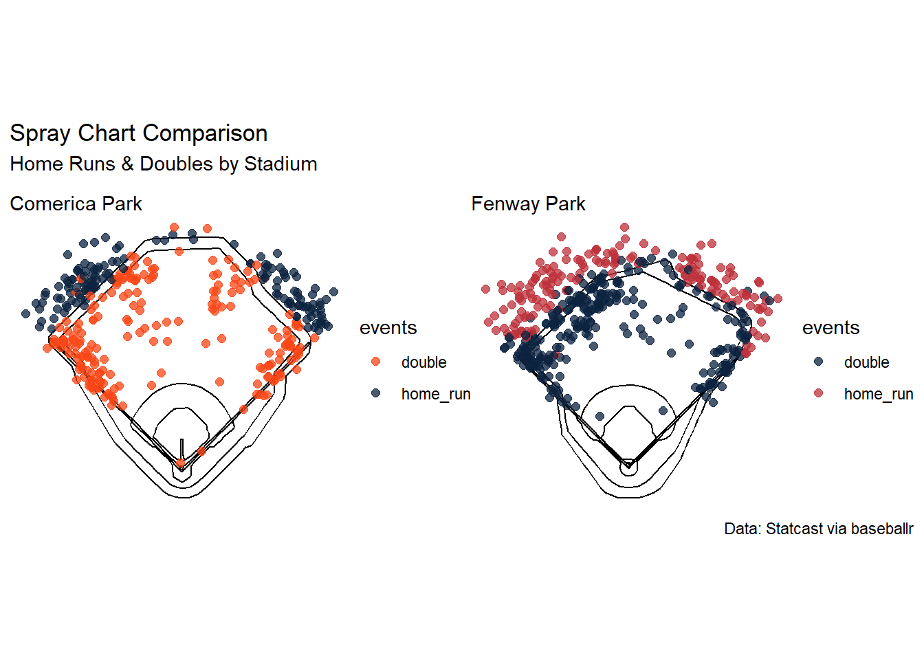
 To begin, the plots shows how home runs and doubles compare across two stadiums. Comerica is known for their deep center field and fenway is known for the very high left field fence (green monster) and we can see there is a higher distribution of home runs in center field in Fenway than Comerica. It can also be seen there are more doubles along the whole left field than at Comerica.
theoretical derivations Link to heading
home_summary <- df2024 %>%
  group_by(game_pk, home_team) %>%
  summarize(
    home_runs_scored = max(post_home_score, na.rm = TRUE),
    home_runs_allowed = max(post_away_score, na.rm = TRUE),
    .groups = "drop"
  ) %>%
  group_by(home_team) %>%
  summarize(
    home_games = n(),
    total_home_runs_scored = sum(home_runs_scored),
    total_home_runs_allowed = sum(home_runs_allowed),
    .groups = "drop"
  )


away_summary <- df2024 %>%
  group_by(game_pk, away_team) %>%
  summarize(
    away_runs_scored = max(post_away_score, na.rm = TRUE),
    away_runs_allowed = max(post_home_score, na.rm = TRUE),
    .groups = "drop"
  ) %>%
  group_by(away_team) %>%
  summarize(
    away_games = n(),
    total_away_runs_scored = sum(away_runs_scored),
    total_away_runs_allowed = sum(away_runs_allowed),
    .groups = "drop"
  )


team_run_summary <- full_join(
  home_summary,
  away_summary,
  by = c("home_team" = "away_team")
) %>%
  rename(team = home_team) %>%
  arrange(team)
table1
| Team | Games | Runs Scored | Runs Allowed | Games | Runs Scored | Runs Allowed |
|---|---|---|---|---|---|---|
| ATL | 77 | 298 | 297 | 78 | 356 | 297 |
| AZ | 74 | 416 | 371 | 80 | 420 | 373 |
| BAL | 78 | 353 | 327 | 75 | 381 | 331 |
| BOS | 74 | 343 | 363 | 79 | 375 | 340 |
| CHC | 76 | 284 | 271 | 77 | 369 | 371 |
| CIN | 78 | 343 | 374 | 73 | 324 | 284 |
| CLE | 74 | 354 | 286 | 78 | 322 | 299 |
| COL | 75 | 366 | 422 | 76 | 272 | 426 |
| CWS | 74 | 236 | 350 | 76 | 242 | 410 |
| DET | 74 | 312 | 301 | 81 | 352 | 320 |
| HOU | 79 | 379 | 319 | 74 | 328 | 299 |
| KC | 76 | 363 | 329 | 73 | 313 | 265 |
| LAA | 75 | 296 | 369 | 78 | 300 | 379 |
| LAD | 77 | 371 | 310 | 74 | 388 | 328 |
| MIA | 79 | 340 | 470 | 71 | 240 | 306 |
| MIL | 74 | 353 | 294 | 83 | 417 | 324 |
| MIN | 75 | 379 | 337 | 78 | 337 | 351 |
| NYM | 78 | 386 | 317 | 78 | 367 | 344 |
| NYY | 78 | 373 | 334 | 75 | 393 | 284 |
| OAK | 79 | 318 | 366 | 73 | 282 | 349 |
| PHI | 75 | 383 | 298 | 77 | 360 | 330 |
| PIT | 79 | 317 | 343 | 73 | 276 | 312 |
| SD | 81 | 362 | 348 | 70 | 339 | 265 |
| SEA | 73 | 278 | 232 | 79 | 360 | 343 |
| SF | 74 | 306 | 312 | 77 | 344 | 336 |
| STL | 75 | 306 | 307 | 78 | 322 | 370 |
| TB | 77 | 293 | 313 | 75 | 276 | 308 |
| TEX | 81 | 321 | 324 | 71 | 297 | 386 |
| TOR | 77 | 320 | 371 | 75 | 317 | 313 |
| WSH | 70 | 287 | 327 | 81 | 313 | 393 |
If we assume that the only factors affecting runs production are the teams offense, teams defense, and then average opponent on offensive and defensive (since we are including every match up it averages out), then the only difference between production at home and away would be the park factor. Note there may be some games left out due to the way scraping worked with the baseballr package and since it included alot of data but since we are averaging it should be negligible.
we can calculate park factor derivation as Runs per game at home stadium divided by runs per game away.
Example calculation for CLE would be [(354 + 286) / 74] / [(322 + 299) / 78] = 1.086, ie roughly 108 runs scored at Progressive field is equal to 100 runs scored at the average stadium.
park.plt <- team_run_summary %>%
  mutate(prkFactor = ((total_home_runs_scored + total_home_runs_allowed) / home_games) /
                     ((total_away_runs_scored + total_away_runs_allowed) / away_games)) %>%
  ggplot(aes(x = fct_reorder(team, prkFactor), y = prkFactor)) +
  geom_col(aes(color = team, fill = team)) +
  mlbplotR::scale_color_mlb(type = "secondary") +
  mlbplotR::scale_fill_mlb(alpha = 0.54) +
  theme_minimal() +
  labs(
    y = "Park Factor",
    title = "Estimated Park Factor by Team (2024)",
    x = "Team",
    subtitle = "Teams listed represent their home stadium"
  ) +
  coord_flip()


park.plt2 <- team_run_summary %>%
  mutate(prkFactor = ((total_home_runs_scored + total_home_runs_allowed) / home_games) /
                     ((total_away_runs_scored + total_away_runs_allowed) / away_games)) %>%
  ggplot(aes(x = fct_reorder(team, prkFactor), y = prkFactor)) +
  geom_mlb_dot_logos(aes(team_abbr = team), width = 0.035, alpha = 0.9) +
  theme_minimal() +
  labs(
    y = "Park Factor",
    title = "Estimated Park Factor by Team (2024)",
    x = "Team"
  ) +
  coord_flip()
park.plt2
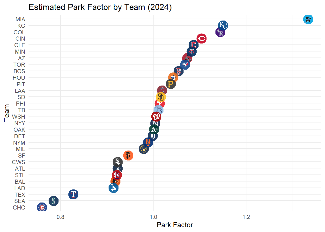
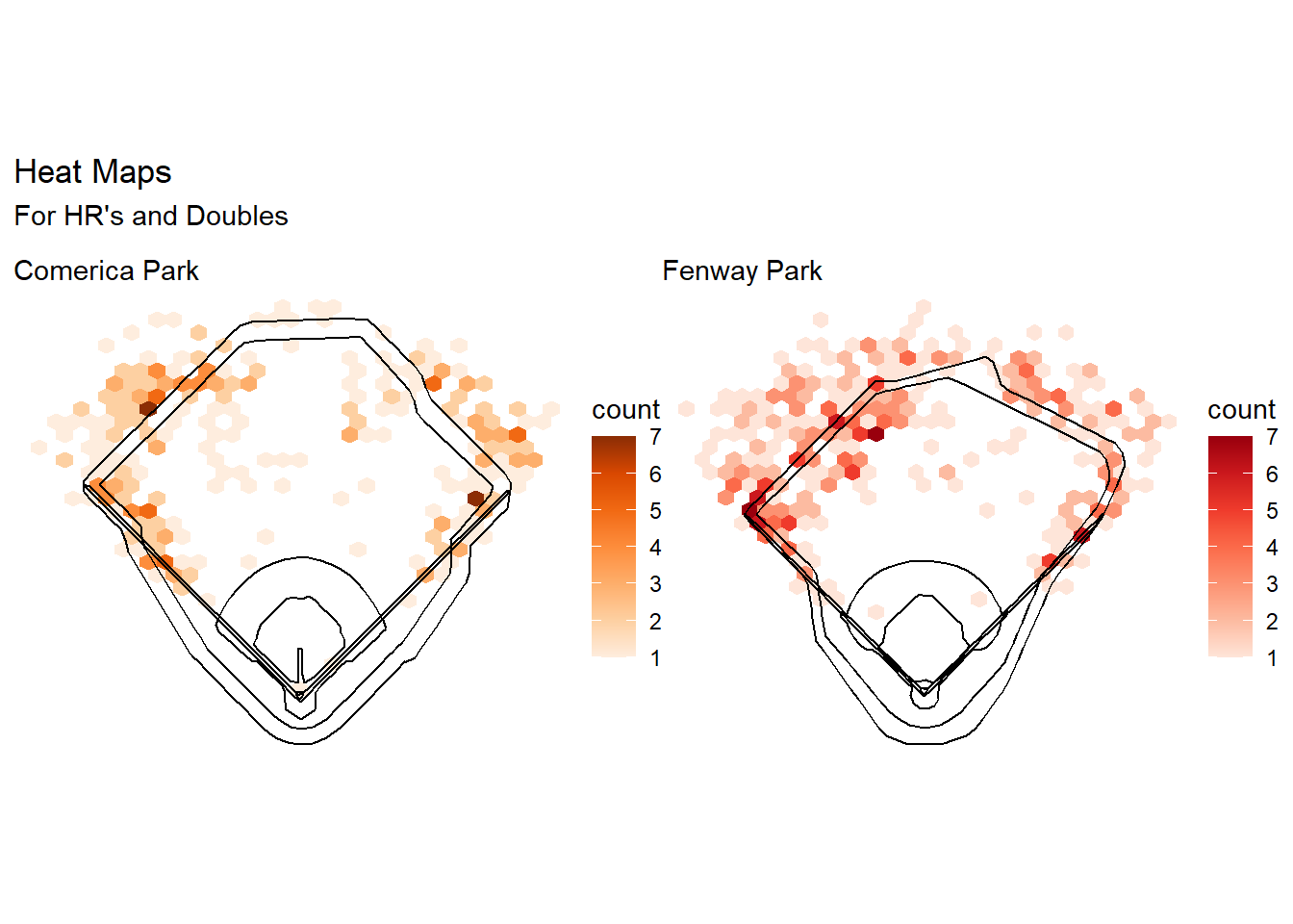
Now looking back at the spraycharts between Comerica and Fenway, Fenway had some area that were more concentrated with home runs and doubles where comerica did not and the park factor agrees saying that Fenway has a factor over 1 whereas Comerica’s is at 1 exactly. It raises the question, are some teams really better offensively than other or does their home stadium just inflate those numbers?
To explore this question we can again assume that away fields average out to 1, thus a new runs scored stat including park factor would be runs scored at home/park factor + runs scored away / 1.
rpg.df <- team_run_summary %>%
  mutate(prkFactor = ((total_home_runs_scored + total_home_runs_allowed) / home_games) /
                     ((total_away_runs_scored + total_away_runs_allowed) / away_games)) %>%
  mutate(rpg = (((total_home_runs_scored / prkFactor) + total_away_runs_scored) /
              (home_games + away_games)))

plt8 <- ggplot(rpg.df, aes(y = fct_reorder(team, rpg))) +
  geom_mlb_dot_logos(aes(x = R.G, team_abbr = team), width = 0.035, alpha = 0.4) +
  geom_point(aes(x = rpg), size = 3, alpha = 0.9, color = "darkred") +
  labs(title = "Runs/Game plot", y = "Team", x = "Runs Per Game", subtitle = "Logos are actual value, red is adjusted for park factor")
plt8
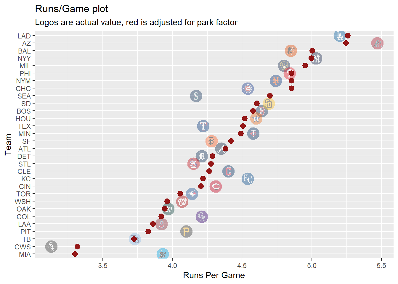 From this plot we can see adjusting for park factors some offensives can be viewed differently, like Miami may have seemed better than they were from their stadium. Even with the park factors the Dodgers were still the best offense which makes sense as they won the World Series in 2024. This plot is interesting as the teams who did really well over the season are still ranked in the top but we can see some small adjustments like maybe the Diamondbacks would have struggled more at a different stadium.
Clustering by rates Link to heading
stadium_summary <- df2024 %>%
  filter(!is.na(launch_angle),!is.na(launch_speed),!is.na(events)) %>%
  group_by(home_team) %>%
  summarize(
    avg_launch_angle=mean(launch_angle),
    avg_exit_velo=mean(launch_speed),
    hr_rate=mean(events=="home_run"),
    double_rate=mean(events=="double"),
    triple_rate=mean(events=="triple"),
    single_rate=mean(events=="single"),
 )
stadium_scaled<-stadium_summary %>%
  column_to_rownames("home_team") %>%
  scale(center=T)
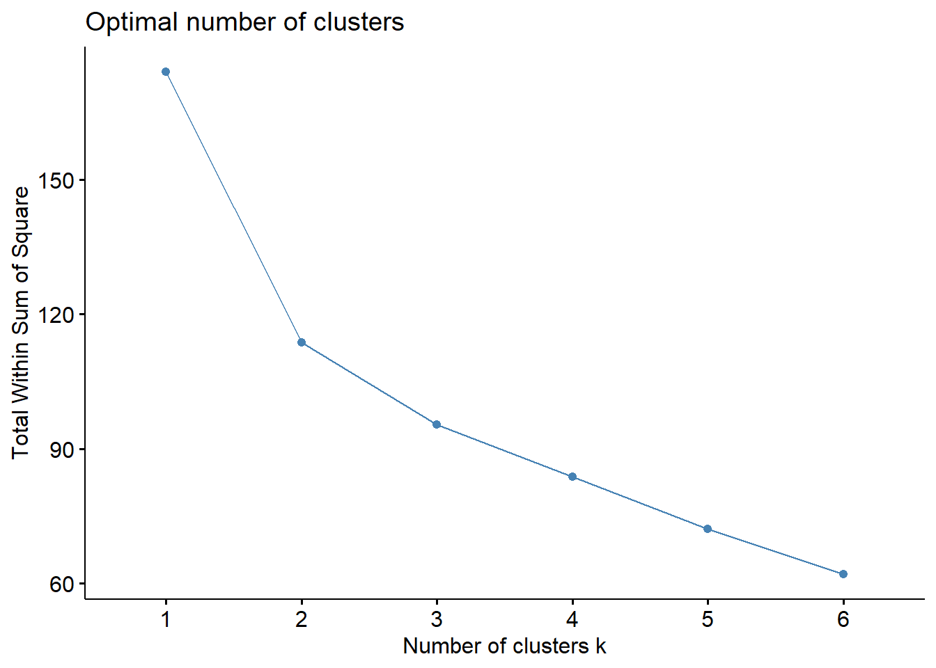
fviz_nbclust(stadium_scaled,hcut, method="wss",k.max=6)
k.out <- kmeans(stadium_scaled, centers = 2)
fviz_cluster(k.out, data = stadium_scaled)
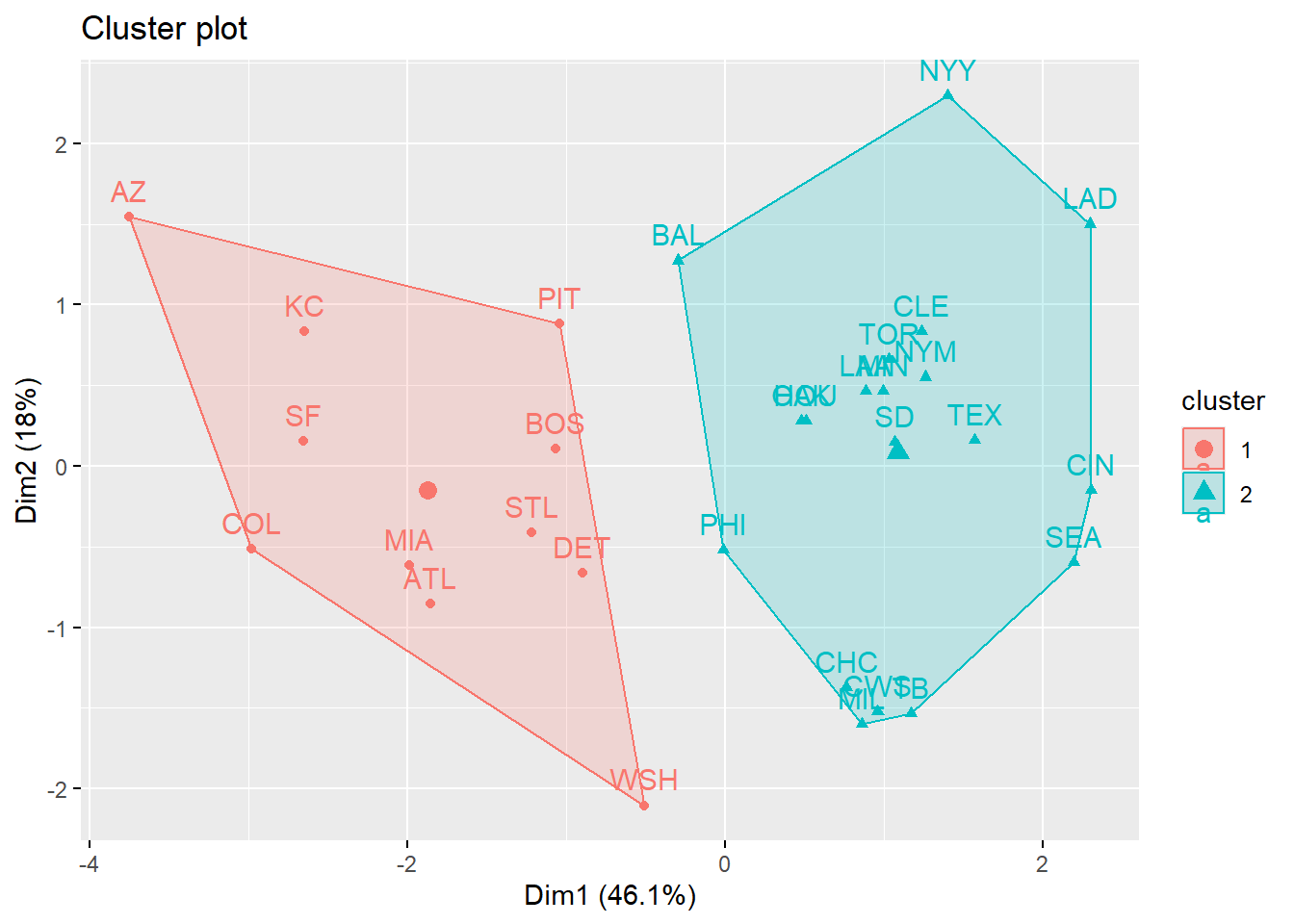
As a way of finding which parks were similar, I clustered the stadium by rates of hits (single, double, triple, home run) and values like exit velocity and launch angle. Using k-means clustering is appear that stadiums fall into 2 groups which may suggest some sort of hitter friendly or pitcher friendly park. Interestingly we can see that LAD and AZ are in different clusters even when they were the top 2 offensive teams in 2024.
Individual park effect Link to heading
Next to further investigate park factors well take a look at exact locations for batted ball. The data includes locations as where the position players closest was, it follows the normal convention of listing positions as number. (pitcher = 1, catcher = 2, first base = 3…)
df_model <- df2024 %>%
  filter(!is.na(hit_location)) %>%
  filter(!is.na(launch_speed)) %>%
  filter(!is.na(launch_angle)) %>%
  mutate(hit_location = as.factor(hit_location))


exPlot <- dftestcood %>%
  filter(home_team == "BOS") %>%
  filter(hit_location == 8) %>%
  ggplot(aes(x = hc_x_, y = hc_y_)) +
  geom_mlb_stadium(stadium_ids = "red_sox", stadium_segments = "all", stadium_transform_coords = TRUE) +
  geom_point(size = 2, alpha = 0.65, col = "#BD3039") +
  coord_fixed() +
  labs(subtitle = "Fenway Park", title = "Hit Location 8") +
  theme_void()
exPlot
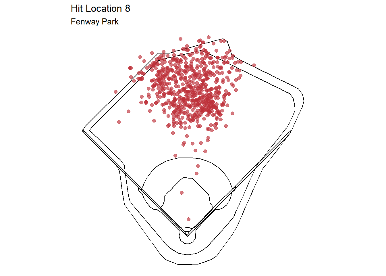 This plot shows an example of all batted balls at Fenway Park that were labeled hit location 8 or center fielder.
plot4 <- df_model %>%
  filter(home_team %in% c("COL", "CHC"), events %in% c("home_run", "double")) %>%
  as.data.frame() %>%
  ggplot(aes(x = launch_speed, y = launch_angle, color = hit_location)) +
  geom_point(alpha = 0.4, size = 1.5) +
  facet_wrap(~ home_team) +
  labs(
    title = "Hit Location by Stadium",
    subtitle = "Home Runs & Doubles",
    x = "Exit Velocity (mph)",
    y = "Launch Angle (degrees)",
    color = "Location"
  ) +
  theme_minimal()
plot4
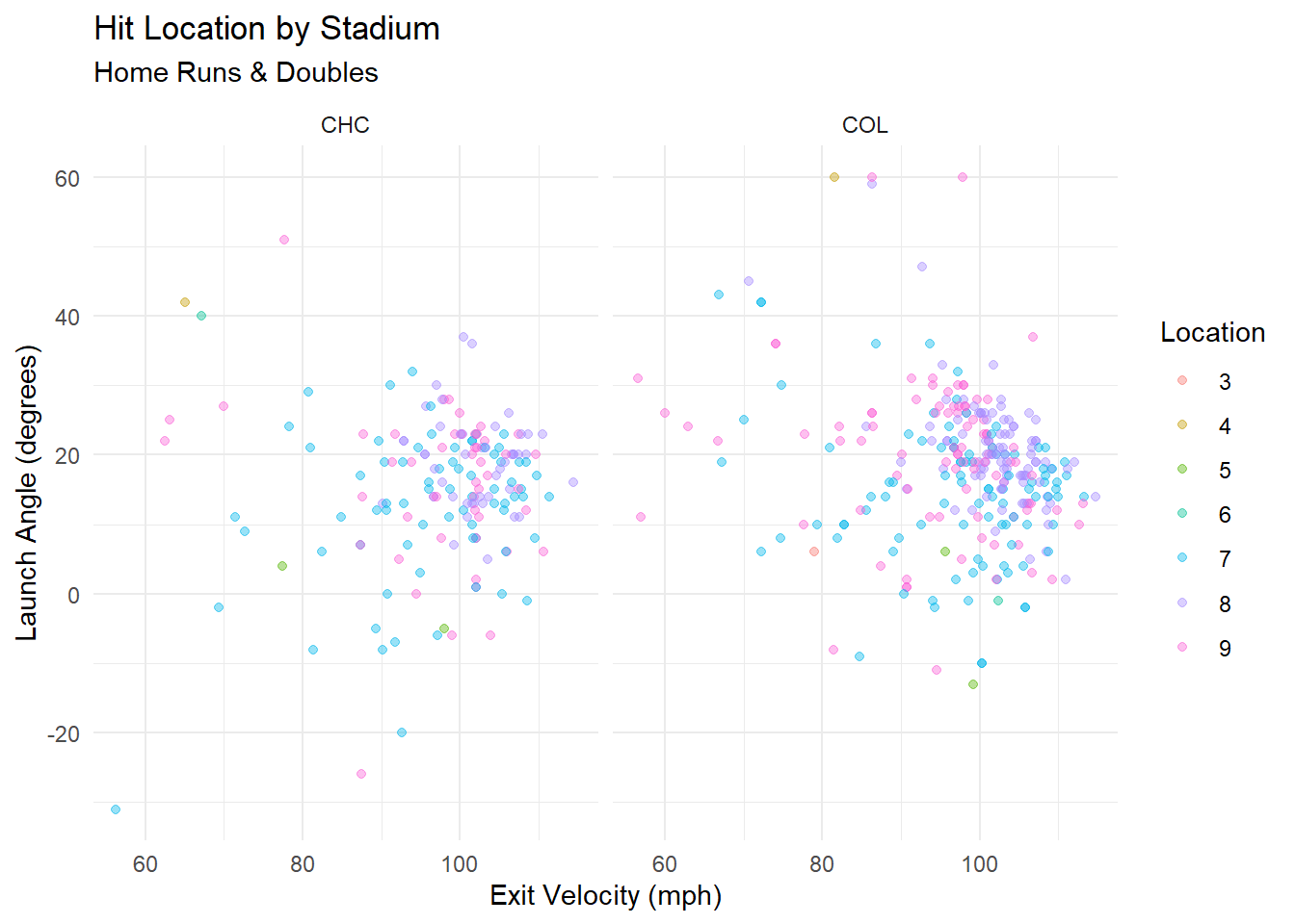 This plot compares launch conditions for home runs and doubles in Wrigley Field (CHC) and Coors Field (COL) which were rated low and high for park factor above. While both parks feature high exit velocities, Coors Field saw batted balls with higher launch angles and similar exit velocities to become hit. This illustrates how the same kind of batted ball can lead to different outcomes depending on the stadium.
set.seed(127)

df_shuffled <- df_model %>% slice_sample(prop = 1)

# 70/30
train_df <- df_shuffled %>% slice_head(prop = 0.7)
test_df  <- df_shuffled %>% slice_tail(prop = 0.3)

rf1 <- randomForest(hit_location ~ launch_speed + launch_angle + home_team,
                    data = train_df)
confPlot
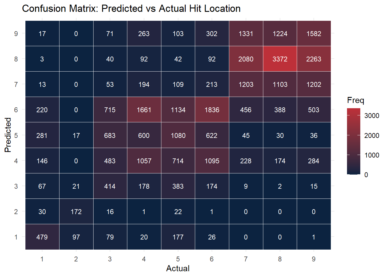 This confusion matrix evaluates how well the random forest model predicts the fielder location (hit_location) based on exit velo, angle, and stadium. While the model performs reasonably well for outfield positions (e.g., 7, 8, 9), there is still some misclassification, particularly in the infield.
Linear model for park effect Link to heading
The data includes variables, wOBA, and expected wOBA, where wOBA is weighted on base percentage, and expected wOBA is formulated using exit velocity, launch angle, sprint speed and batted ball type. We can assume then that the park factor would contribute to the difference in expected value and the actual value. So if we model the difference between these 2 with linear regression and use launch angle and exit velocity as covariates then adding in which ball park it took place in the coefficients will give an estimate to the park factor. So positive values would indicate inflated stats where as negative values would indicate deflated stats.
df2024$woba_diff <- df2024$woba_value - df2024$estimated_woba_using_speedangle

lm_model <- lm(woba_diff ~ launch_speed + launch_angle + home_team, data = df2024)
woba_effects <- coef(summary(lm_model)) %>%
  as.data.frame() %>%
  rownames_to_column("term") %>%
  filter(grepl("home_team", term)) %>%
  mutate(team = gsub("home_team", "", term))

prkfactorplot <- ggplot(woba_effects, aes(x = reorder(team, Estimate), y = Estimate)) +
  geom_col(fill = "#333366", color = "#C4CED4") +
  coord_flip() +
  labs(title = "Estimated Park Effect w/ wOBA (Actual - Expected)",
       y = "wOBA Difference coefficient", x = "Stadium") +
  theme_minimal()
prkfactorplot
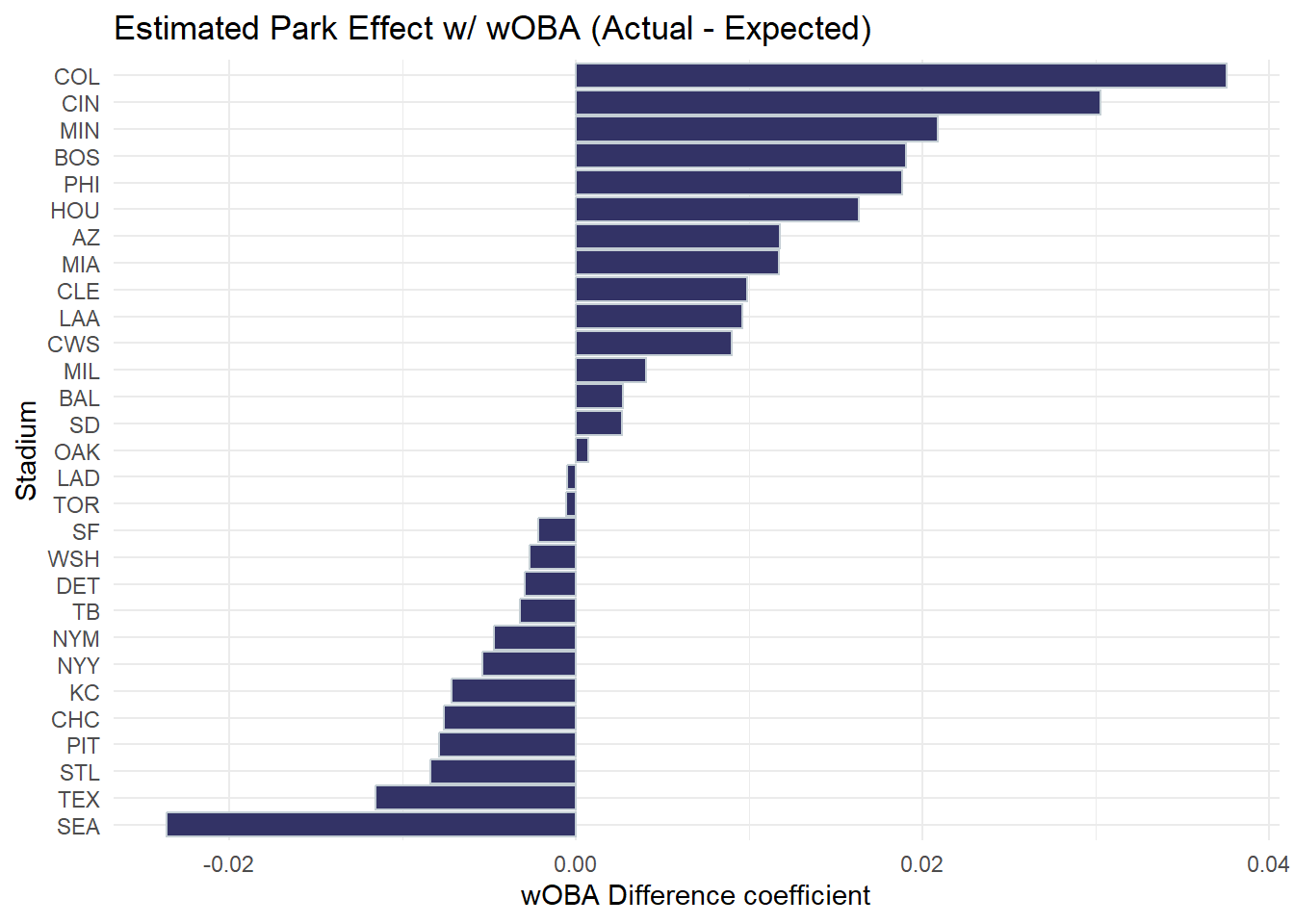
This plot shows the estimated effect of each stadium on a batted ball’s value using a linear model of actual wOBA minus expected wOBA. Parks like COL and BOS inflate expected value, while SEA and STL slightly suppress outcomes.
Random Forest simulation Link to heading
Finally lets explore whether a batted ball with the same launch conditions ie. velocity and angle would be different from stadium to stadium. To test this I will again use random forest to model the event being a hit (single, double, triple, home run) using launch conditions and also stadium, then I will predict on a random 20% of the events from the dataset and compare how the model treats them all across every stadium.
df_model <- df_model %>%
  mutate(is_hit = ifelse(events != "out", 1, 0))
df_model$is_hit <- as.factor(df_model$is_hit)

rf2 <- randomForest(is_hit ~ launch_speed + launch_angle + home_team,
                    data = df_model, ntree = 200)
set.seed(42)
example_hits <- df_model %>%
  sample_n(20000) %>%
  select(launch_speed, launch_angle)


stadiums <- sort(unique(df_model$home_team))

simulated_hits <- example_hits %>%
  slice(rep(1:n(), each = length(stadiums))) %>%
  mutate(home_team = rep(stadiums, times = nrow(example_hits)))

simulated_hits$prob_hr <- predict(rf2, newdata = simulated_hits, type = "prob")[, "1"]


prkplot3 <- ggplot(simulated_hits, aes(x = fct_reorder(home_team, prob_hr, .fun = median), y = prob_hr)) +
  geom_boxplot(fill = "#00A3E0", alpha = 0.7, color = "#000000") +
  coord_flip() +
  labs(
    title = "Predicted Hit Probability Across Parks",
    subtitle = "Same Launch Conditions Simulated Across All Stadiums",
    y = "Predicted Hit Probability",
    x = "Stadium"
  ) +
  theme_minimal()
prkplot3
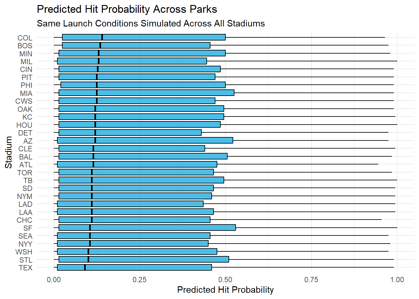
By simulating identical batted ball across all stadiums, I estimated the prob of a hit in each stadium. Again Colorado at the top (median value) while others were lower again. This reinforces the idea that park factors exist but with probability very similar in median and spread it might not be the most important aspect.
Conclusion Link to heading
This project supports the idea that MLB stadiums have some park factors that influence the game, like offensive performance. Through spray charts, park factor calculations, clustering stadiums and supervised learning techniques, it appears appropriate to conclude not all batted balls are equal and depends on where they happened. By simulating identical batted balls across every stadium we found a consistent difference between certain stadiums, like Colorado’s vs Seattle. These finding can support the importance of adjusting for location when evaluating performance.